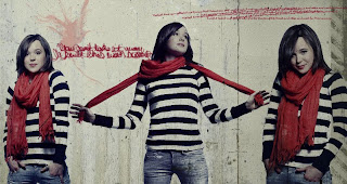
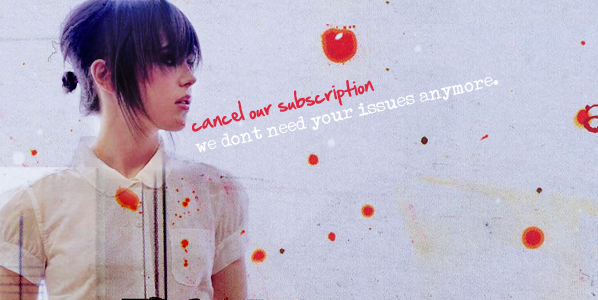
the image i used for the background is a texture, but it's still considered an image
so i set the texture to "darken" im pretty sure...on top of all the layers, making it look like it was the background. then i used some brushes to bring it all together. =)


4 comments:
i like the person to red ratioo
i like photo. she is so cute i want to hug her haha. I like the colors in it. yes kayla, we know you like ratios.
derdi
You should choose this for the photobook because it's done really well, and I like how the brushes add to the photo, and they don't take away from the main photo.
i like the red to hair to strips ratio i think u should use this for the photobook
Post a Comment